In today’s data-driven world, Business Intelligence (BI) tools promise powerful insights and streamlined reporting. Yet, the humble spreadsheet and slideshow persist in the white-collar world. While BI tools manages complex analysis and visualization, spreadsheets and slideshows offer unique advantages that keep them firmly entrenched in our workflows.
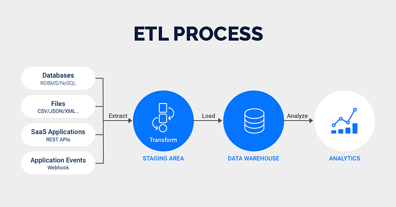
Figure 1: ETL Phases
Overview
Some reasons why spreadsheets and slideshows persist in the office workflow, include:
Familiarity and Ease of Use
Flexibility and Control
Storytelling and Communication
Collaboration and Sharing
Ad-hoc Analysis and Exploration
Cost and Accessibility
While BI tools may be transforming the way we analyze data, it’s clear that spreadsheets and slideshows aren’t going anywhere anytime soon. They serve a different purpose, filling a gap that BI tools often miss.
Building a Python-Powered Data Pipeline
Business Intelligence (BI) tools are powerful, but they can also be expensive and complex. What if you could build a custom, flexible, and potentially more cost-effective solution using Python?
This post explores how you can leverage Python to collect, transform, and deliver data to Spreadsheets and Slides for compelling presentations. Why Python?
Python has become a powerhouse in data science and automation. Its rich ecosystem of libraries makes it ideal for data manipulation, and seamless slides interaction. This combination offers a powerful alternative to traditional BI tools for certain use cases.
In this post we shall propose the use of Python (to collect, cleanse and transform data), Google Spreadsheets (to store transformed data) and Google Slides (to showcase visualizations). Proposed Workflow
Imagine you need to generate a weekly sales report and all you have to do is to run the next command:
And, voila! you have your weekly report updated and ready to present in Google Slides.
Environment settings
Show code
# Import authenticator and gspread to manage g-sheetsfrom oauth2client.service_account import ServiceAccountCredentialsimport gspread# Import other librariesimport numpy as npimport pandas as pdimport polars as plimport duckdb as dbimport jsonimport warningswarnings.filterwarnings('ignore')
Show code
# get tokenfilename ='credentials.json'# read json filewithopen(filename) as f: keys = json.load(f)# read credentialstoken = keys['md_token']
Extract Phase
Show code
# connect to motherduck cloudconn = db.connect(f'md:?motherduck_token={token}')
Which restaurant chain has the maximum number of restaurants?
Show code
chains = ( conn.sql(''' select name, count(name) as no_of_chains from restaurants group by name order by no_of_chains DESC limit 10 ''').df())chains
name
no_of_chains
0
The Burger Joint
721
1
Pizza Palace
703
2
Greek Gyros
696
3
Cafe Delight
692
4
French Delights
681
5
The BBQ Shack
671
6
The Golden Wok
667
7
Ocean Breeze
665
8
Spice & Bloom
665
9
Midnight Diner
657
Table 4: Data grouped by restaurant chains
Which restaurant chain has generated maximum revenue?
Show code
revenue = ( conn.sql(''' select name, sum(rating_count * cost) as revenue from restaurants group by name order by revenue DESC limit 10 ''').df())( revenue .style .hide() .format({'revenue': '{:,.2f}'}))
name
revenue
The Burger Joint
108,820,424.64
Pizza Palace
100,382,853.92
Cafe Delight
98,037,063.93
Greek Gyros
96,403,445.25
The BBQ Shack
96,286,414.02
Ocean Breeze
95,664,612.77
The Golden Wok
94,860,125.75
Spice & Bloom
91,824,854.56
French Delights
91,236,701.38
Midnight Diner
91,170,162.30
Table 5: Data grouped by restaurant and revenue
Which city has generated maximum revenue?
Show code
cities = ( conn.sql(''' select city, sum(rating_count * cost) as revenue from restaurants group by city order by revenue DESC limit 10 ''').df())( cities .style .hide() .format({'revenue': '${:,.2f}'}))
DataFrame uploaded to: workbook: restaurants, sheet: cities
Close connection
Show code
# close connectionconn.close()
Retrieve data from gsheets
Show code
# Access worksheet iddf_id ='1JNAWb2QkFwh61v7QwEEVZnNhTPS0csbdMdll9y1csEg'df_workbook = gc.open_by_key(df_id)# Access data by worksheet sheetdf = df_workbook.worksheet('data')# Save data to tabledf = df.get_all_values()# Save accessed data from google sheets to dataframedf = pd.DataFrame(df[1:], columns=df[0])
Show code
df.head()
Last update
0
Feb 24, 2025
1
2
name
rating_count
cost
city
cuisine
rating
3
The Golden Wok
1477
33.62048759
Berlin
American
5
4
Greek Gyros
770
68.38887409
New York
French
1
Table 7: Data Saved on Gogle Sheets
Google Sheets Report Data
Figure 2: Google Sheets Data for Presentation Report
Sync between Google Sheets and Google Slides
Simply we copy and paste with sync for each table and chart and customize our slides.
Figure 3: Synchronization between Google Sheets and Slides
While BI tools are valuable, Python offers a compelling alternative for building custom data pipelines. By leveraging the power of Python using polars and duckdb libraries for data collection and transformation, and libraries like plotly for visualization you can create a flexible, cost-effective, and automated solution for delivering data to Google Spreadsheets, using gspread, and Google Slides for impactful presentations, by sync between these Google apps.
This approach empowers you to take control of your data and create highly tailored reporting solutions by replacing BI license costs.
References
Business (2023) How to Design a Dashboard Presentation: A Step-by-Step Guide in slidemodel.com
Karlson, P. (2022) Are Spreadsheets Secretly Running Your Business? in Forbes
Monroy, Jesus (2024) Why BI Tools Fall Short: PowerPoint and Excel Still Rule the Business World in Medium
Moore J. (2024) But, Can I Export it to Excel? in Do Mo(o)re with Data
Schwab, P. (2021) Excel dominates the business world… and that’s not about to change in Into the Minds